Introduction: The Anatomy of a High-Converting Landing Page
Traffic is a vanity metric if it does not translate into business growth. You can drive thousands of clicks to your website through Google Ads, Meta campaigns, and organic search, but if your landing page fails to capture attention, build trust, and compel action, you are simply burning marketing budget.
A high-converting landing page is not a digital brochure; it is a dedicated conversion engine designed with a singular focus: persuading visitors to exchange their contact information for a valuable offer. Unlike a homepage that serves multiple navigation paths, a conversion-optimized landing page acts as a one-way street. Every element—from the headline and hero image to the form length and social proof—must work in absolute harmony to guide the user toward a single call to action (CTA).
In this comprehensive guide, we will break down the exact strategies, psychological principles, and structural frameworks top digital marketers use to build landing pages that consistently turn cold traffic into qualified leads.
1. Understanding User Intent and Traffic Alignment
Before writing a single word of copy or designing a layout, you must answer one fundamental question: Who is landing on this page, and what do they expect to see?
Matching Message Match
Message match is the seamless continuity between the ad, social post, or email link the user clicked and the landing page they arrived on. If your ad promises a “Free Local SEO Audit Checklist for Small Businesses,” your landing page headline must immediately echo that exact promise.
The Cost of Mismatch: When users click an ad and land on a generic page where they have to hunt for the offer, cognitive friction spikes. This leads to immediate bounce rates and wasted ad spend.
The Solution: Create dedicated landing pages for every distinct traffic segment, keyword cluster, and ad campaign. Align your visual styling, terminology, and core value proposition directly with the ad copy that preceded it.
Recognizing User Intent Stages
Not all traffic is ready to buy or even submit a lead form immediately. Your landing page must reflect where your visitor sits in the conversion funnel:
Top of Funnel (ToFU): Visitors seeking educational content, guides, templates, or checklists. Offer low-friction lead magnets (e.g., PDF guides, calculators).
Middle of Funnel (MoFU): Visitors comparing solutions or evaluating specific tools. Offer webinars, product demos, case studies, or consultations.
Bottom of Funnel (BoFU): Highly qualified prospects ready to make a purchasing decision. Offer free trials, direct consultations, quotes, or software walkthroughs.
2. Crafting High-Impact Headlines and Subheadings
Your headline is the single most critical element on your landing page. According to digital marketing pioneer David Ogilvy, on average, five times as many people read the headline as read the body copy. If your headline fails to hook the reader within three seconds, they will click the back button.
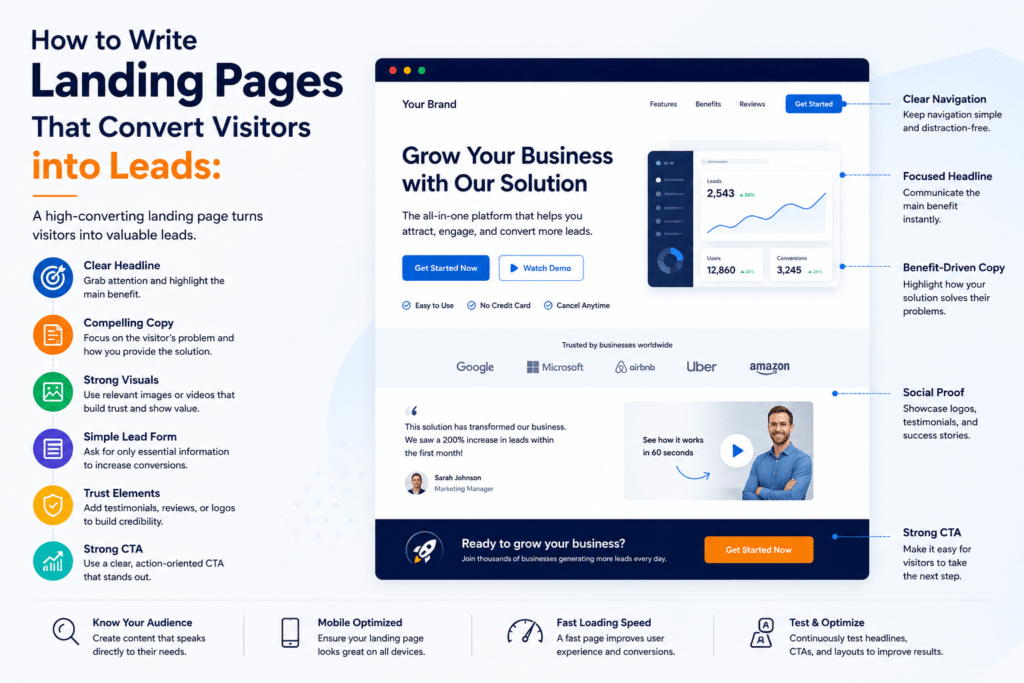
The Anatomy of a Conversion-Driven Headline
A powerful landing page headline must achieve three objectives instantly:
Clarity over Cleverness: Visitors should never have to guess what you do or what you are offering.
Value Proposition: It must communicate the primary benefit or transformation the user will experience.
Relevance: It must confirm to the user that they are in the exact right place.
Formula Examples:
The Direct Benefit Formula: [Achieve Desired Result] Without [Common Pain Point]
Example: “Generate Qualified B2B Leads Without Spending Hours on Cold Outreach.”
The How-To Formula: How to [Achieve Goal] in [Timeframe or Step-by-Step Method]
Example: “How to Optimize Your Google Ads Quality Score in Under 10 Minutes.”
The Question Formula: Want to [Achieve Goal]? Here’s How.
Example: Want to Double Your Local Store Footfall? Claim Your Free Digital Marketing Blueprint.
Writing Compelling Subheadings
While the headline captures attention, the subheading seals the deal by adding context. It should expand on the headline’s promise, explain how you deliver it, or address any lingering skepticism.
Pro Tip: Keep your subheading concise—ideally one to two sentences—and format it in a slightly smaller font than the main headline, positioned directly beneath it in the hero section.
3. Designing a High-Converting Hero Section
The hero section is the portion of the landing page visible above the fold (without scrolling). This real estate is prime digital acreage; it dictates whether a user stays or bounces.
Essential Components of an Optimized Hero Section
Compelling Main Headline & Subheading: Clear, benefit-driven text communicating your core offer.
Visual Asset: A professional product screenshot, a clean mockup of the lead magnet, a video walkthrough, or an authentic hero image showing real people experiencing the benefit.
Lead Capture Form or Primary CTA Button: Depending on your strategy, either place a short inline form directly in the hero section or feature a prominent anchor button that scrolls smoothly to the form.
Trust Signals: Mini-logos of clients, a quick star rating badge, or a brief security reassurance note right below the CTA.
The Role of Imagery and Video
Human beings process visual information 60,000 times faster than text. However, avoid generic stock photos of smiling people shaking hands over corporate boardrooms. Instead, use:
Product Contextual Shots: Real UI screenshots or dashboard views for SaaS products.
Tangible Assets: 3D mockups of ebooks, checklists, or toolkits for service providers and agencies.
Short-Form Explainer Videos: A 60 to 90-second video in the hero section can increase conversion rates by up to 80%, as it allows users to absorb information effortlessly while building instant rapport.
4. Structuring Persuasive Landing Page Copy
Once you have captured attention above the fold, your body copy must systematically dismantle objections, highlight key features, and prove your credibility.
Focus on Benefits, Not Just Features
A common copywriting mistake is listing technical specifications rather than human outcomes.
Feature: “Our software includes automated keyword tracking and multi-location rank reports.”
Benefit: “Never miss a ranking drop again—automatically track your local SEO performance across every target neighborhood in real-time.”
Using the PAS Copywriting Framework
One of the most effective psychological frameworks for landing page copy is PAS (Problem-Agitation-Solution):
Problem: Clearly articulate the specific pain point your target audience is facing right now.
Agitation: Deepen the pain by highlighting the negative consequences of inaction (e.g., wasted ad budget, lost revenue, falling behind competitors).
Solution: Position your product, service, or lead magnet as the frictionless, proven remedy to their problem.
Scannability and Formatting
Online readers do not read word-for-word; they scan. Make your copy effortlessly readable by implementing:
Bullet Points: Break down key takeaways, modules, or inclusions into clean bullet lists.
Bold Text: Highlight important phrases and key metrics to guide the scanner’s eye.
Short Paragraphs: Limit paragraphs to two or three sentences to maintain visual white space.
5. Building Trust with Social Proof
In a digital landscape filled with exaggerated marketing claims, skepticism is at an all-time high. Social proof acts as psychological insurance, reassuring prospective leads that others have trusted you and achieved success.
Types of Social Proof to Include
Client Testimonials and Quotes: Feature headshots, full names, and company titles alongside authentic quotes detailing specific results achieved.
Case Studies & Success Metrics: Use hard data where possible (e.g., “Helped a local retail brand increase online inquiries by 142% in 60 days”).
Trust Badges & Certifications: Display partner badges (e.g., Google Partner, Meta Business Partner), industry association memberships, or secure checkout/privacy guarantees.
Press Mentions and Media Logos: “As seen in…” banners featuring reputable industry publications or local media outlets.
Note on Authenticity: Avoid fabricated testimonials. Consumers can spot fake reviews instantly. Real, specific feedback with verifiable details always outperforms generic praise.
6. Mastering Lead Capture Forms and Friction Reduction
The form is the gateway to conversion. Every single field, label, and design choice you introduce here directly impacts your conversion rate.
The Form-Length Dilemma: Short vs. Long
Shorter Forms (Name & Email): Yield higher conversion volume. Best for top-of-funnel lead magnets, newsletter signups, and initial content downloads.
Longer Forms (Adding Phone Number, Budget, Company Size): Yield lower conversion volume but dramatically higher lead quality. Best for high-ticket B2B services, enterprise software demos, and agency consultations.
Best Practices for High-Converting Forms
Minimize Friction: Only ask for information you genuinely need to initiate the sales or follow-up process. If you do not need a phone number on day one, remove it.
Use Clear Placeholder and Label Text: Ensure input labels are bold and easy to read above the form fields.
Optimized CTA Button Copy: Never use generic words like “Submit” or “Click Here.” Use action-oriented, first-person phrasing that reminds the user what they are getting:
Weak: Submit
Strong: Get My Free Audit Now / Download the Checklist / Claim My Consultation
Privacy Assurance: Add a micro-copy note directly beneath the form button: “We respect your privacy. No spam ever. Unsubscribe at any time.”
7. Mobile Optimization and Page Speed
Over 60% of all web traffic originates from mobile devices. If your landing page is sluggish on smartphones or requires horizontal scrolling, your conversion rate will plummet regardless of how brilliant your copy is.
Mobile-First Design Principles
Thumb-Friendly CTAs: Ensure primary call-to-action buttons are large, prominent, and easily clickable with a thumb without accidental misclicks.
Responsive Layouts: Test your forms, images, and text wrapping across multiple screen resolutions to prevent awkward text overlaps or cut-off containers.
Simplified Mobile Navigation: Hide complex header menus on landing pages to keep users laser-focused on the conversion goal.
The Critical Need for Speed
Every second of delay in page load time drops conversion rates drastically.
Compress Images: Use next-gen formats like WebP and compress all graphics before uploading.
Minimize Scripts: Audit your third-party tracking pixels, chat widgets, and tag manager scripts to prevent bloated code from slowing down server response times.
Leverage Browser Caching & CDNs: Ensure your hosting environment is optimized for lightning-fast content delivery.
8. Post-Conversion Strategy: The Thank-You Page
Conversion does not end when the user clicks the submit button. The Thank-You Page is one of the most underutilized assets in digital marketing.
Maximizing the Thank-You Page
Confirm Delivery: Clearly state that their resource has been emailed to them or provide an immediate direct download link.
Set Expectations: Let them know when they will hear from your team or what the next steps in the onboarding process are.
Introduce a Secondary CTA: Now that they have converted into a lead, guide them deeper into your ecosystem:
Invite them to join a private community or follow your social channels.
Offer an exclusive one-time upsell or a consultation booking calendar (e.g., Calendly embed).
9. Continuous Optimization: A/B Testing and Analytics
Launching a landing page is only the starting line. True conversion rate optimization (CRO) relies on continuous data analysis and iterative testing.
What Elements Should You A/B Test?
Headlines: Test benefit-driven vs. question-based headlines.
CTA Button Color and Text: Experiment with contrasting button colors and action-oriented first-person button copy.
Form Length: Test a 2-field form against a 4-field form to evaluate lead quality versus conversion volume trade-offs.
Visuals: Test a product mockup graphic against a short video hero asset.
Key Metrics to Monitor
Conversion Rate (CR): Total conversions divided by total unique visitors multiplied by 100.
Cost Per Acquisition (CPA) / Cost Per Lead (CPL): Total ad spend divided by the number of leads generated.
Bounce Rate: The percentage of visitors who leave without interacting with the page.
Heatmaps and Session Recordings: Utilize tools like Microsoft Clarity or Hotjar to visualize where users scroll, click, and drop off.
Summary Checklist: Your High-Converting Landing Page Blueprint
[ ] Targeted Alignment: Is your landing page copy directly matched to the ad or traffic source that brought the user there?
[ ] Clear Value Proposition: Does the main headline communicate a compelling benefit within 3 seconds?
[ ] Engaging Visuals: Does your hero section feature a clean mockup, contextual product shot, or explainer video?
[ ] Scannable Body Copy: Are you using bullet points, short paragraphs, and bold text to highlight key takeaways?
[ ] Credible Social Proof: Do you feature authentic client testimonials, case study metrics, or trust badges?
[ ] Frictionless Form: Is your form as short as possible while capturing necessary lead data, paired with a compelling CTA button?
[ ] Mobile Responsiveness: Does the page load in under 2.5 seconds and display flawlessly on mobile devices?
[ ] Post-Conversion Experience: Does your Thank-You page confirm delivery and guide the new lead to their next step?